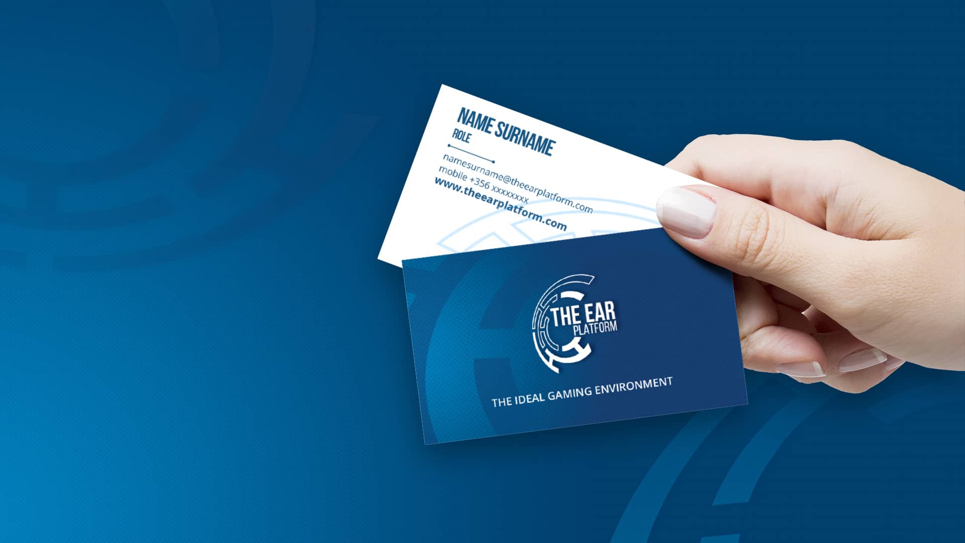
The Ear Platform - logo design
I joined The Ear Platform Ltd, a gaming startup, in January 2017 as the only graphic
designer. We were very few, and we were building almost everything from scratch, so my first
duty was to design the company logo.
During the logo process, I had meetings with shareholders asking them to describe what they
had in mind thinking about the company, about the main features and values of the company.
Findings:
- Technologies
- Stability
- Flexibility
- Tailor made solutions
- Innovation
- Customer satisfaction
Based on these feedbacks, I decided to focus the design on creating a mark that reminds these features, looking at the latest graphics trend and colour psychology
I presented a few drafts, and shareholders decided to continue with the idea of a bionic ear, shaped by a very minimal robotic style.
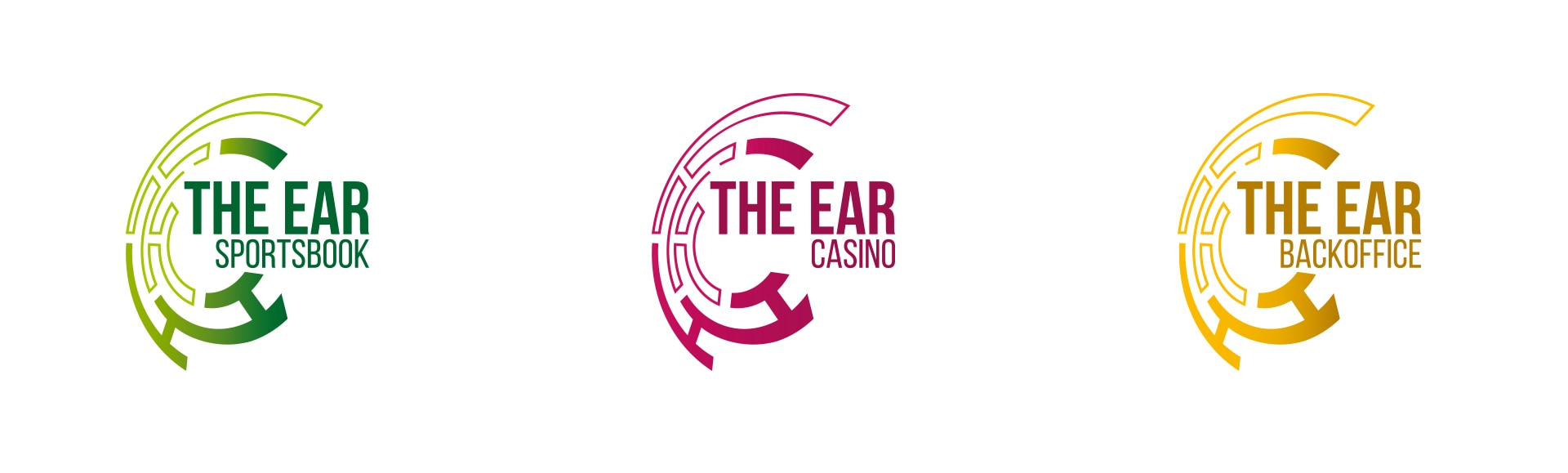
I chose blue and light blue as main colours, meaning loyalty, technology, stability, and using the gradient to highlight the constant progress and innovation values. The logo has applied to various products, so different colours were used to identify every single service the company provides.